After 12 Years, FHWA Decides Experimental Sign Typography Is No Better
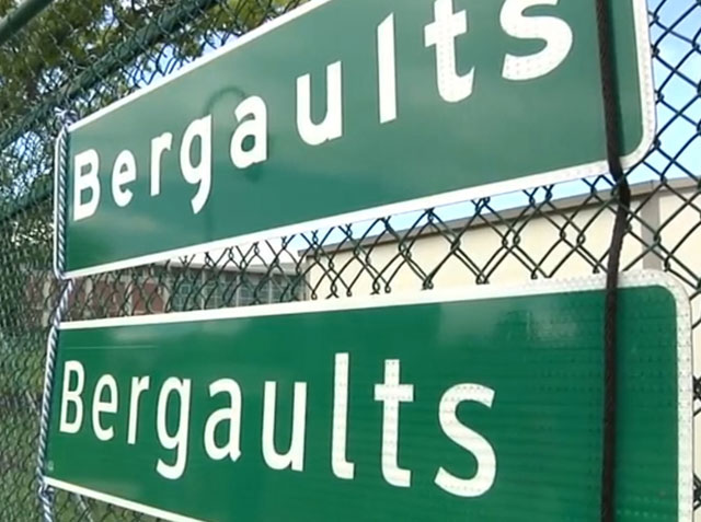 Traditional "Highway Gothic" on top; experimental "Clearview" on bottom Via The Hardest Year on YouTube
 You may not have noticed, but for the past 12 years or so road signs on some federal highways have used a new font type known as “Clearview,” touted as easier to read from a distance and at night.
But as of Feb. 23, Federal Highway Administration officials are banning the erection of new Clearview signs they have been deploying since 2004 after recent research showed they are not easier to read than the government’s traditional “Highway Gothic” font signs.
In fact, the agency said in a Jan. 25 Federal Register posting that the use of the two fonts has confused motorists, even though they might not even realize it.
“Although seldom specifically identifiable by the motorist, non-uniformity of a sign display or sequence of signs might exhibit itself in less direct ways, such as diminished legibility, requiring additional glance time directed toward a sign or group of signs instead of toward the traffic on the road,” the agency said.
A 2003 study by the Pennsylvania Turnpike Institute helped convince FHWA to grant interim approval to use the Clearview “alternative letter style” since it would be easier to read.
“In two PTI studies intended for conventional road guide signs, use of an early version of the Clearview bold improved nighttime sign reading distance by up to 16% when compared with the E-modified road sign typeface,” according to FHWA. “For drivers traveling at 45 mph, that legibility enhancement could easily translate into 80 extra feet of reading distance, or a substantial 1.2 seconds of additional reading time. On a road with a posted speed of 45 mph, a driver is traveling at 66 feet per second. With Clearview-bold, the desired destination legend is recognized 1.3 seconds earlier [84 feet] and with greater accuracy, giving the driver significantly more time to react to the information displayed.”
What a difference a decade makes. Now officials say further evaluation can’t show any benefit from the Clearview font.
“Based on these findings, FHWA does not intend to pursue further consideration, development or support of an alternative letter style,” the agency said. “Accordingly, FHWA discontinues further implementation of an alternative letter style and terminates and rescinds the interim approval for new signing installations.”
In his Feb. 4 blog, FHWA Administrator Gregory Nadeau said, “Once signs using Clearview reach the end of their useful life, they will be replaced with new highway signs that feature approved fonts from the standard alphabets known as Highway Gothic.”